
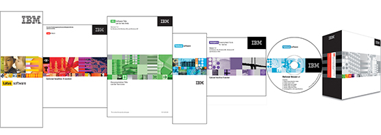
IBM software branding
IBM is a business monument and a technology icon. It commands respect for its commitment to quality and innovation as well as for its design heritage.
The IBM software branding approach is based on a combined analysis of IBM, its competition and contemporary notions of software and branding.
Case study emphasis:
– Conceive a branding strategy that allows for distinct brands to combine into an integrated offering
– Enable the branding to evolve in order to support changing initiatives such as the new e-business on-demand campaign
– Develop a flexible and highly branded visual language
Related brand systems:
ThinkPad TVT
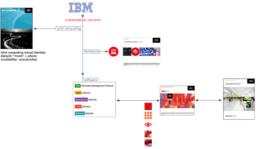
IBM Grid Computing
Related branded campaign:
IBM Middleware
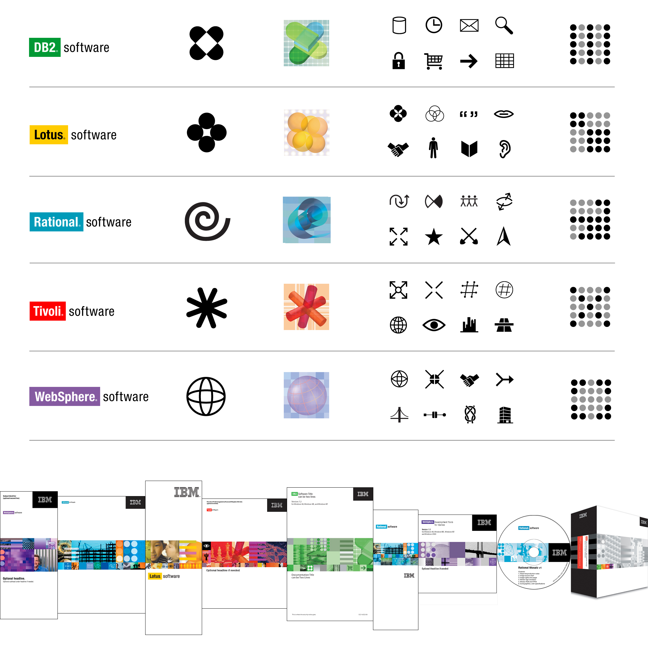
Although it is not an explicitly branded entity, the notion of “IBM software” is intended to emerge in the minds of consumers. The (de facto) IBM software brand derives from the sum of distinct yet fully integrated brands:
+ DB2, green
+ LOTUS, yellow
+ TIVOLI, red
+ WEBSPHERE, purple
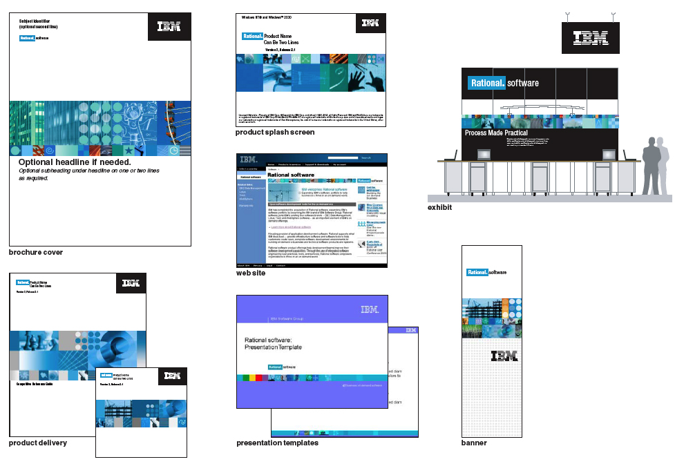
+ RATIONAL, teal
= IBM software
These brands need to exist in several states:
– independently
– in different configurations
– as a fully integrated set
Color functions both to unify and identify the different brands within the group. It enables consumers to recognize the software names as sister brands, all supported by the power of the IBM family.
The second unifying device for the IBM software brands is THE RIVER, a horizontal strip that spans across the majority of software communications.
In combination with the white background it conveys a sense of clarity and OPENNESS, which is a core IBM attribute.
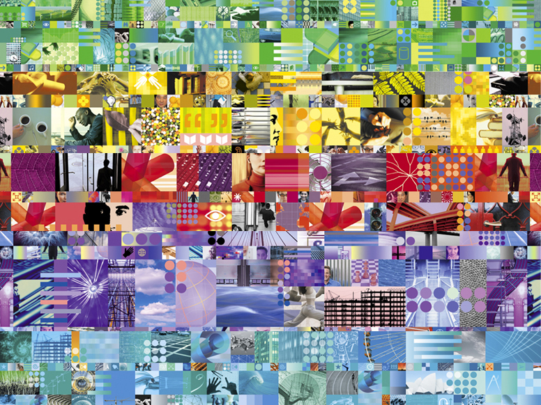
The combined use of THE MOSAIC and THE RIVER concept throughout all forms of communication allows a connection between the five software brands. It is an on-going thread of visual narrative that evolves with new technologies and new business strategies. In that sense, it is to branding what autonomic computing is to IBM software.
A mosaic is never presented in its entirety. It is merely a resource to work from. A composition is obtained by cropping sections of the mosaic.
From a graphical standpoint, the coherence of the system allows to modulate and customize the mosaic without loosing branding integrity.
The mosaics reinforce fundamental IBM software brand attributes, such as:
– MODULAR
– FLEXIBLE
– ADAPTABLE
There is one pre-designed Brand Mosaic for each one of the five IBM software brands as well as one for cross-branded communications. All the mosaics use imagery of nature and urbanism as metaphors.
These brand mosaics are used as a source for cropping compositions. These can also be modified.
It is sometimes necessary to present a multiple brands offering in a single form of communication:
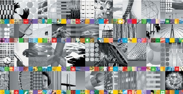
The cross brand mosaic is intended for such opportunities. It repurposes imagery from all brand mosaics. It is a mostly grayscale mosaic anchored on a full-color strip.
IBM software keywords:
– on-demand
– federated
– global/universal
IN: identity