Manetti Shrem Museum
Environmental and Communication graphics: donor wall, exhibition pegwall, tagline logotype, posters, brochures, gift products
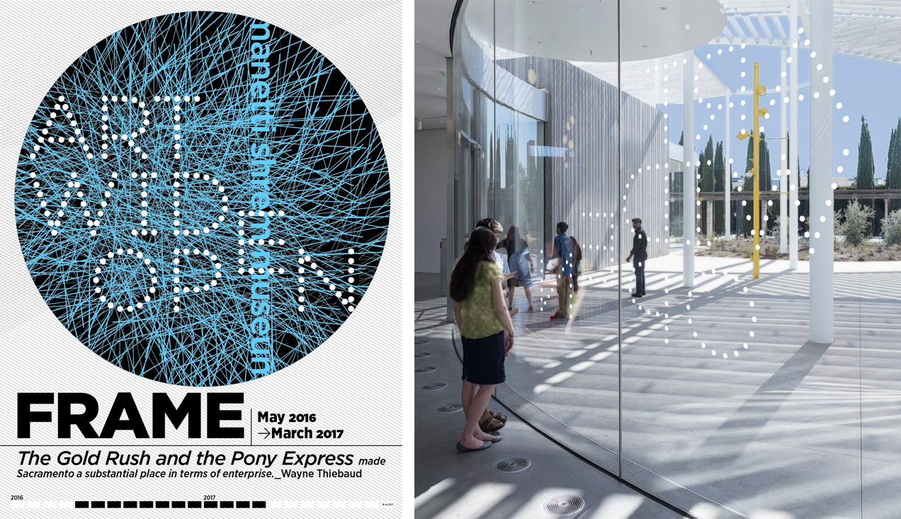
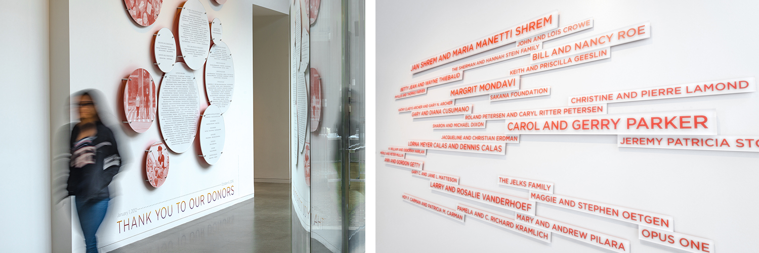
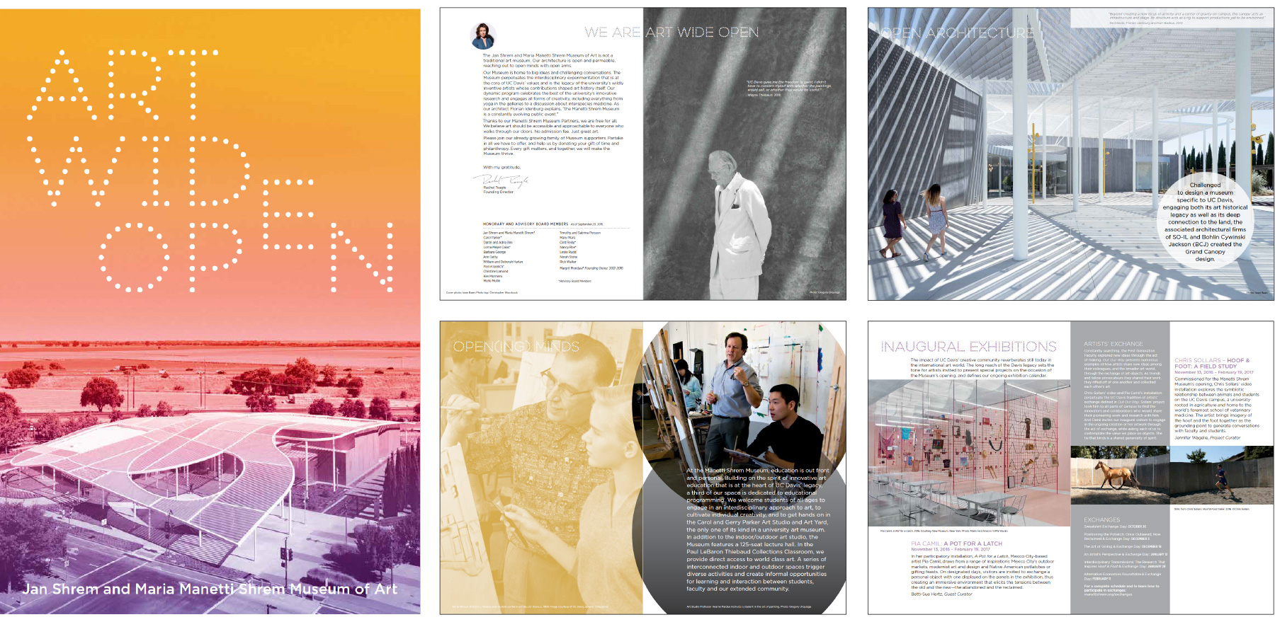
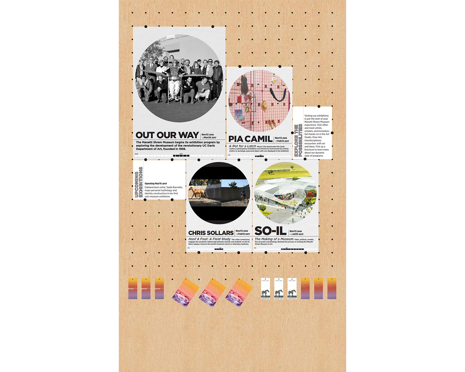
Conception of a design system to rationalize and implement communication graphic interventions throughout the lobby areas. Design references taken from the SO-IL architecture design include materials, shapes, color, and texture, in particular, maple, steel, perforations, shadows, circles and glass. M-A-D created the MSM grand opening logo tagline from dots as an extension of the architecture. The information wall at the main gallery entrance is designed as a 14′ x 9′ maple peg board to be used as a modular setting for current and upcoming exhibition posters. Similarly, all brochures and pamphlets are designed with a circle punch in order to hang on pegs. The main capital donor wall allows for inexpensive scalability when additional donors are added. The names are silkscreened on individual transparent acrylic bars of varying sizes, each with a different height standoff and back-painted orange to create halation. On the annual donor wall replaceable graphics are sandwiched between 2′ to 5′ transparent disks also back-painted orange and on standoffs.
< concept poster
< exterior tagline signage
< annual donor wall & capital donor wall
< brochure
< exhibition info wall
IN: environmental, print


