COMPAQ brand redesign
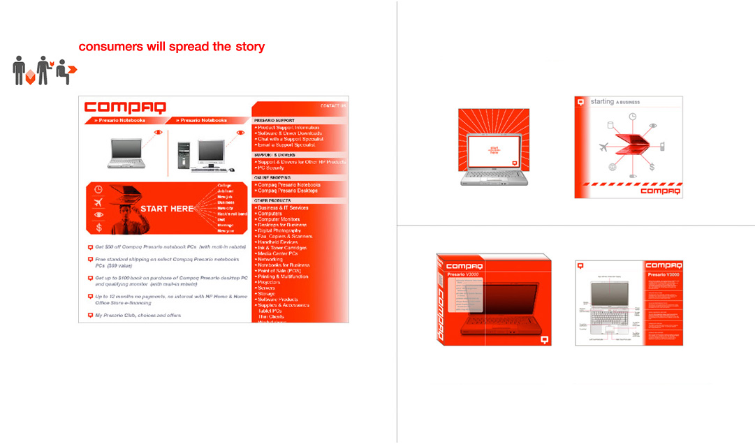
A brand audit and repositioning strategy geared towards high school, college and 1st time buyers. The campaign was researched and conceived in less than 30 days. Among many components, it included dozens of symbols and logotypes with brand implementations in all major supports: web, packaging, collateral, etc.
Our mission was:
1. to help rethink the repositioning of the brand in its new markets.
2. to design a new visual identity with concept implementations in all media.
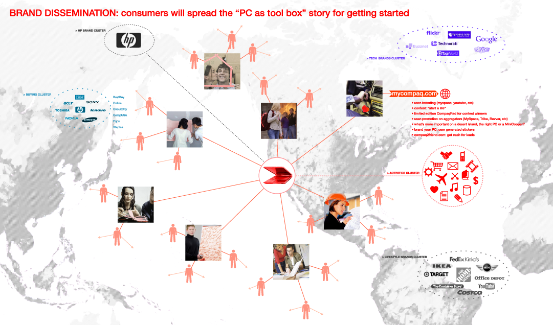
The the core idea for our brand campaign was based on the 2006 premise of a rising culture of social media.
One of our main proposition was anchored on the idea that computers are tool boxes ready to help users make anything they chose to.
IN: identity


