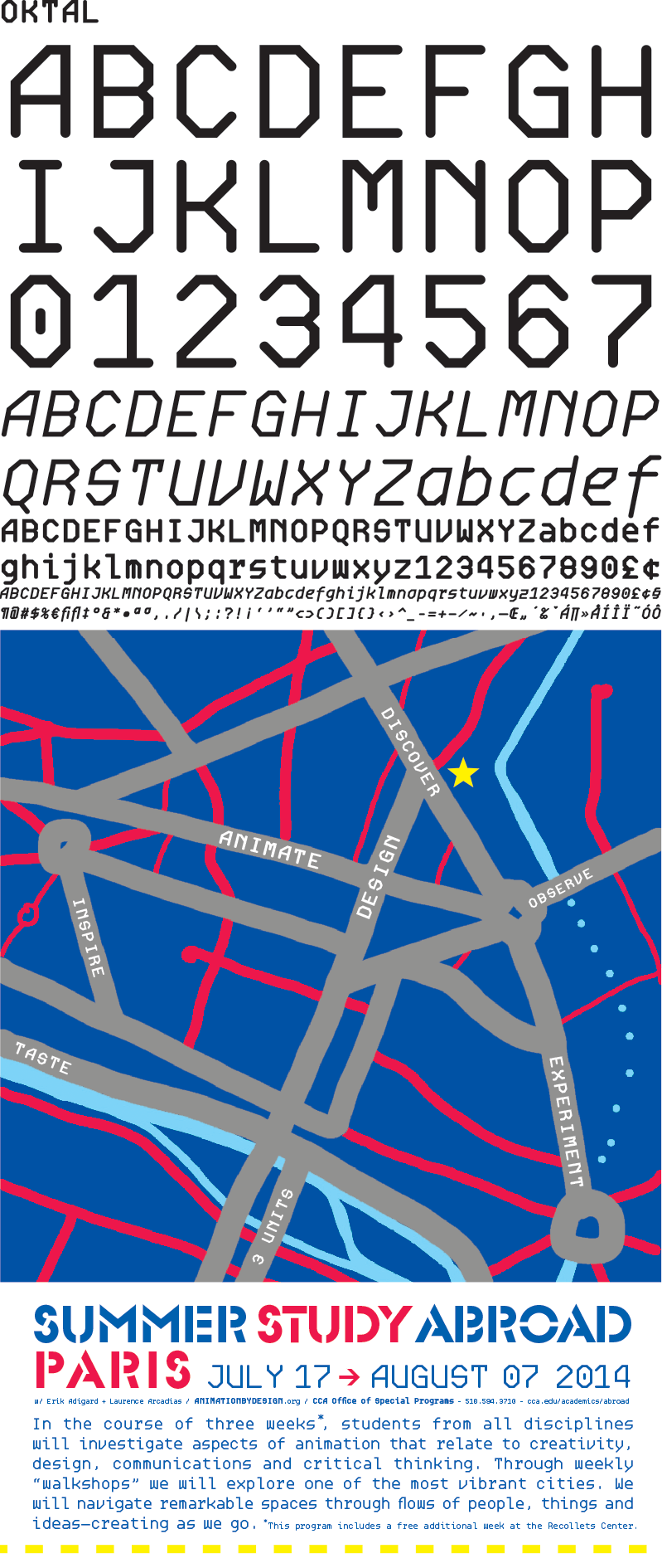
OKTAL / monospace typeface
A monospaced type family composed of entirely mono-linear and modular structure, Oktal Mono first began as a design-philosophical discourse between Joachim Müller-Lancé and Erik Adigard of the design studio M-A-D in Sausalito, California. The typeface later came to life as a design experiment wherein a type designer (Joachim) and a graphic designer (Erik) collaborate each in their own capacity, from within their respective disciplines.
Erik had proposed the idea of a typeface concept that would be intentionally generic but with no curves whatsoever, approaching legibility by breaking expected curves into facets. Joachim concerned himself with examining systematically what happens when a circle is reduced or translated to a square, hexagon, and octagon, and which of these treatments appear the “least alien” to the original design: A condition that might even depend on the relation of type size to line width—smaller sizes requiring fewer facets so they won’t look merely like crumpled curves.
After an octagonal base was determined most appropriate for the average text size, the required glyphs were assembled on a square grid like a construction toy, yielding large numbers of variations. Lastly, in lively discussion as always, character shapes were selected for the best fit in rhythm and a consistent aesthetic.
IN: print

